


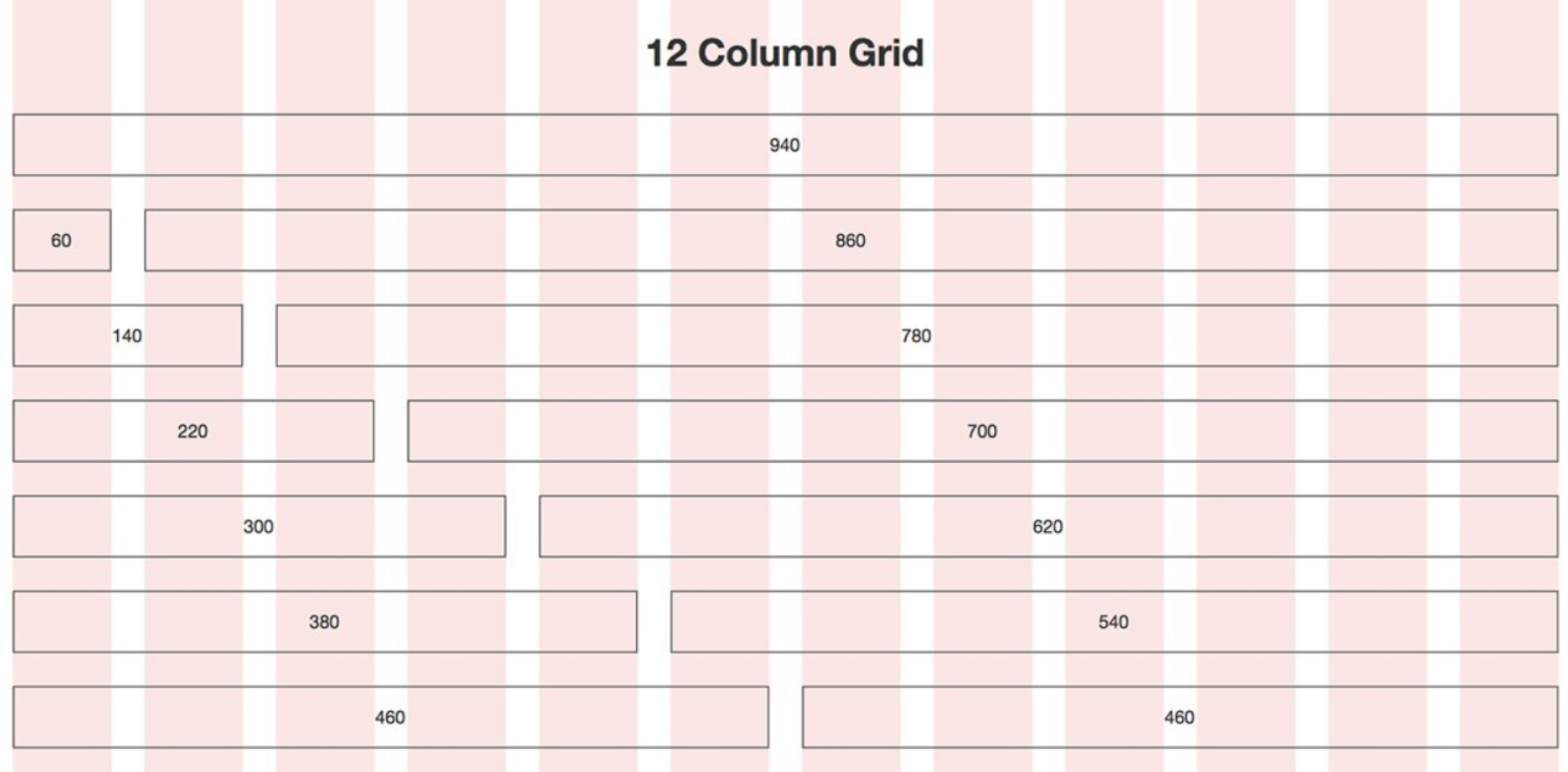
The 12-column grid system is one of the most enduring and versatile tools in the web design toolkit. Whether you're an independent designer or part of a team, understanding and utilizing this layout can have a transformative effect on your projects. In this article, we'll delve into why the 12-column grid system is essential for any UI/UX designer and how it can serve as a strong foundation for your designs.
Flexibility for Varied Content Types
One of the main advantages of using a 12-column grid in web design is its inherent flexibility. With 12 columns, you can easily create a wide variety of layouts to accommodate text, images, and other multimedia elements. It provides a harmonious structure that makes your design adaptable across multiple devices and screen sizes.
Consistency Across Platforms
A 12-column grid system promotes consistency. As web design projects often require cross-platform compatibility, a unified grid structure can make the development process smoother. This uniformity helps in maintaining the same look and feel across different platforms, making your website or application more cohesive.
Easier Collaboration
When a team of designers is working on the same project, having a standardized grid makes collaboration simpler and more effective. Everyone understands the fundamental structure, making it easier to discuss modifications and improvements. For larger teams, this is an indispensable benefit.
Improved User Experience
The 12-column grid system isn't just beneficial for designers; it also improves the user experience. A well-structured layout helps users navigate the site more comfortably and find the information they’re looking for effortlessly. Moreover, grid systems can also enhance readability and visual appeal, both crucial aspects of effective UI/UX design.
Mathematical Harmony
Why 12 columns? The number 12 is divisible by 2, 3, 4, and 6, giving you multiple ways to divide the page and organize content. This mathematical harmony allows for more varied and balanced designs, making it a favorite among designers who aim for proportion and balance.
How to Get Started
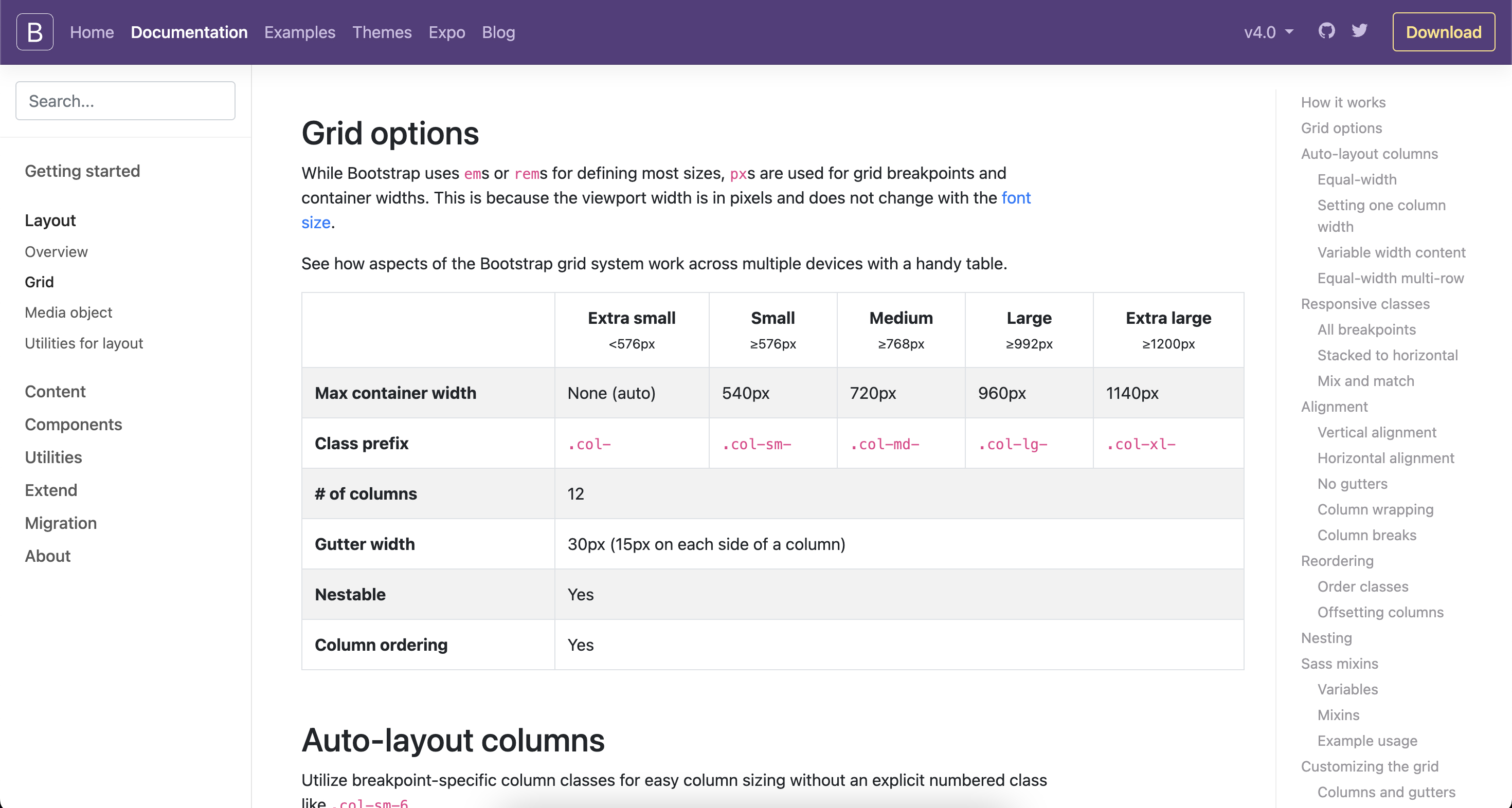
Implementing a 12-column grid system is easier than it may appear. You can use CSS frameworks like Bootstrap or your own custom CSS to initiate the grid. There are also many design tools available that provide grid system templates that you can readily use as a starting point.
Conclusion
The 12-column grid system is a vital component in the toolset of any seasoned UI/UX designer. Its benefits range from heightened flexibility and consistency to enhanced collaboration and improved user experience. So whether you're a freelancer, part of an agency, or someone interested in web design, the 12-column grid system is worth incorporating into your practice.
Enhance your project by employing a 12-column grid system with Fikri Studio. Contact us to find out how.
The benefits are hard to ignore, and the implementation is more straightforward than you might think. If you're looking to optimize your web designs, consider Fikri Studio's experience in effectively utilizing 12-column grid systems for various client projects. Contact us today to discuss how we can help you take your designs to the next level.


